Monday, December 31, 2012

Christmas Dance

Still trying to get my mojo back.  Dumped some pictures from my camera this morning which put me in the mood to scrap some.  Found a sketch for 4 photos over in the archives at Inspired Blueprints that I thought would work well with Mara's Christmas Dance pictures. 

Sketch:
My layout:

I used Holiday Harmony II DSP, seam binding bow, Christmas Jingle for the holly and ornament, and Hand Selected embellishments for the fancy "C" and the journaling spot.

TFL!


Sunday, December 30, 2012

Christmas Card Photo Shoot!

Had a quick few minutes to scrap, so that's what I did!  I'm in a total slump right now so I'm forcing myself to sit down and try to scrap.  Ugh, I so wish I wasn't in this slump.  As always, I went on a mission to find a sketch I liked and didn't have to go too far.  One of the first places I always stop at is Sketchabilities.  Here's their latest sketch:

And here's my  take on the sketch:


I used Candy Cane Lane DSP and embellishments and buttons, some stitching, grosgrain bow and a tag for the gifts is from Get It Done....all Stampin' Up products on this one.  Pictures that I used on our Christmas card this year.  TFL!

Tuesday, December 18, 2012

I know...

it's almost Christmas, so why am I posting a Halloween layout?  Well, because I was on my blog uploading the Polar Express layout when I realized I had a few things I'd created that I haven't shared on my blog lately.  What better time than now to schedule them?

This is a layout I created for McKenna's very first paying acting gig!  It was only one night as a fill in for someone on the Haunted Train, but it paid!  Gotta love that!  The other pics are of her during her performance, but the pics were taken by Steve on his cell, so they aren't the greatest, but at least it was documented.


TFL!


Monday, December 17, 2012

Christmas Card 2012

We are never together long enough to be able to get a family picture, so the other night after the girls took their showers I told them to just put something on and I'd just shoot some pics real quick.  After I took the pics, I sat down with my My Digital Studio and designed the card in like 15 min!  Uploaded to mpix.com and got them 3 days later.  You just can't beat that for spur of the moment stuff!  Now, I just have to wait on Steve to correct and update our address lists and send them out.  I thought at first I just may get them out by Dec. 23, but that's not looking like that's going to happen!  LOL!  Anyway, here's the Birrell Christmas Card of 2012!


I can't remember the names of the stuff I used.  It's DSP and embellishments that came with the original My Digital Studio.  I recolored the ribbon to match (LOVE that new option!!) and used some digi tape.  

TFL! 

Sunday, December 16, 2012

Found time to scrap!

The holiday season is in full swing!  I've been busy getting stuff ready for Christmas, but, who hasn't?!?!  I was fortunate enough to have a weekend free of any obligations this weekend!!  No work (hospital or pictures), no cheer competitions, nothing....except running McKenna to and from French Lick for her "job", which is the subject of my layout tonite!  As me, Steve, Mara and Micah were playing Monopoly tonite, I was making tags for my homemade laundry detergent and homemade fabric softener that I'm giving as gifts this year that I decided to just scrap a page while I already had my My Digital Studio open!   And, of course, I used a sketch....


And here's my layout!


I used a free kit from Design House Digital...super cute, isn't it?!  Pics are of my middle daughter holding her first paycheck from her second acting gig of the year....elf/chef on The Polar Express!  She was the youngest that has ever been able to work on The Polar Express and she was totally pumped.  She worked all but 1 of the performances....31 out of 32 performances!  She raked in the dough!  Warner Bros. execs even made their way to some of the performances to see why this particular Polar Express has grown by leaps and bounds over the last couple of years.  

TFL!

Sunday, November 11, 2012

I found a new sketch site!

I found a new sketch site and they just happen to be having a Design Team call!  We all know what a sucker I am for sketches, so you know I'm trying for the DT!

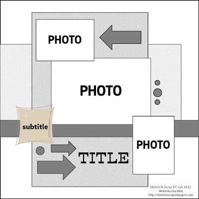
Here's the sketch you are to create with:


And here's my layout!


So, where is this new source of sketch happiness I came across?  Sketch~N~Scrap!  Go check it out!  And even better, join me in trying out for the DT!  

I used the Shabby Hollow digital kit by Amy Teets Designs....cute, isn't it?!


Tuesday, October 09, 2012

Animal Kingdom


Now's about the time I'm starting to forget what layouts I've posted! LOL!  Sorry if any of these are duplicates!  

Top layout....Finding Nemo.  Really really cool show.  Loved it.  Used a free kit I got from kellybelldesigns.com called Quack Me Up. 

Middle layout....Kilimanjaro Safari.  Tip: go in the morning.  Supposedly they are more active earlier in the day.  This is a Stampin' Up DSP, I just don't remember what it's called. 

Bottom layout....Tree of Life.  Got the info on it from the internet.  Background paper is not SU, but the tag is.

TFL!


Monday, October 08, 2012

Animal Kingdom


Top layout....Dinosaur!  Intense ride.  There was no way I could take pics inside.  Such a bumpy, jerky ride, too.  But, the more intense the better for us!  I used Juntos DSP, Downtown Grunge, and starburst punches to mimic the name of the ride (look in the picture!).

Middle layout....King Louie and Baloo.  King Louie was so funny!  Grad Party DSP.

Bottom layout....Expedition Everest!  Awesome ride!  Our favorite ride at Animal Kingdom.  We were able to ride this like 4 or 5 times toward the end of the day because there was noone in line!  Downtown Grunge DSP and matching embellishments, Epic Overlays and Celebrations for the pennant stamps. 

TFL! 


Sunday, October 07, 2012

Asher's turning 5!!


Holy cow, where has the time gone?!?!?  I was there when this little guy was born and it doesn't seem like 5 years ago!  He's a huge Cardinals fan, so Kasara wanted me to come up with a baseball inspired birthday invitation, so this is what I did!  I found a baseball and Cardinals logo clip art on Google images.  Saved them to my computer as a jpeg and then inserted them on the invite!  Easy peasy!  There was some shadowing around the Cardinals logo, so I just used punches and filled them in with whisper white to cover it  up.  Awesome right?!  

I used stitching and a label punch and the clip art for this and that's it.  

TFL!


Friday, October 05, 2012

Insert Duplicate Page Mirrored!


2 2pagers today.  I'm not a fan of 2 pagers.  Not sure why, just not.  Even digitally, I'm still not a fan.  But, this option of "insert duplicate page mirrored" is a dream come true for someone like me!  

Both layouts are created with Stampin' Up DSP, just not sure of the names of either of them.  I know, I'm a totally rotten demonstrator.

Top layouts are just various pictures taken at a couple of parades we saw at Magic Kingdom.  

Bottom layouts are various pictures taken on Main Street at Magic Kingdom.

TFL! 

Thursday, October 04, 2012

Hollywood Studios


Top layout: Fantasmic!  Awesome show!  Get there early to get a seat, though!  My pictures aren't the greatest, but I scrapped them anyway.  Mostly Stampin' Up stuff on this layout.

Middle layout: Toy Story Mania.  Fun little ride!  Probably the longest we waited in line for any ride, but I think it was worth it.  The giant Mr. Potato Head really interacted with the people standing in line.  He started to talking to Micah and she didn't know what to think!  Mostly Stampin' Up stuff on this layout as well.

Bottom layout: Backlot Tour.  The girls thought it was super cool that the hen house from the Hannah Montana movie was there.  Kellybell Designs for everything on this layout.


Wednesday, October 03, 2012

Magic Kingdom


Top layout:  Just random pics taken at Magic Kingdom.  Rides we rode, but really didn't warrant an entire layout about, etc.  Pattern paper is from a free kit I found on the internet somewhere, called Remember the Magic.

Middle layout:  Enchanted Tiki Room.  Stampin' Up DSP, but I can't remember the name, dahlia's.  I looked up the Enchanted Tiki Room on the internet and the journaling has the number of different birds and flowers that are in that attraction.  

Bottom layout:  Jungle Cruise!  Micah was just singing the birthday song yesterday that was sang on this ride!  LOL!  Cute ride.  Love the punny cruise directors!  Look closely....one of the few times I show up in the disney album....pic of me with my wonderful step-mother-in-law! 


Tuesday, October 02, 2012

Hollywood Studios


Top layout: Phineas & Ferb!  No, not my kids in the pictures.  But,the girls wanted me to take their pictures, but the line was too long and they didn't want to stand in line!  LOL!  Stampin' Up DSP and embellishments, but I can't remember the name. :(

Middle layout: Same thing....too long of a line to stand in, but the girls wanted me to get pictures!  Pattern paper and embellishments from Kellybell Designs.

Bottom layout:  Honey, I Shrunk the Kids play area.  You would think my girls would get tired of a place like this.  Nope.  I couldn't get them out of there!  Woodland Walk DSP, grosgrain knot, tag is from the Number One kit, i believe. 


Monday, October 01, 2012

Ok, back to Disney layouts....

Yep, back to the Disney layouts!


Top layout: Mara had been dying for one of those giant turkey legs all week, so on the last day we let her get one!  That thing was HUGE!  Well Worn DSP and Epic Overlays stamp brush set (love that set!!), grosgrain ribbon and knot.

Middle layout: Pinocchio!  Most of the paper and elements are from Kellybell Designs.  The banner is from Stampin' Up, along with the baker's twine bows.

Bottom layout: Tomorrowland Speedway at Magic Kingdom.  Poor Micah wasn't tall enough to ride by herself, so she had to ride with Steve.  DSP is from Day in the Life, photo corner punch.  Ribbon and stars are from Kellybell Designs. 


Sunday, September 30, 2012

Love u

While my girlies were away at camp this summer, it's tradition that I make them a card and send it to them while they are away.  This is the card I made them this year!


I'm pretty sure I CASE'd this from something I pinned on Pinterest.  Easy peasy card.  Color combo is from the color coach...Old Olive, Rich Razzleberry, Marina Mist, Daffodil Delight.  The stamp is from P.S. I Love You which is retired.  

TFL!


Saturday, September 29, 2012

For the dog lover....

This is the card I created for the monthly card swap at Tiffany's, but I can't remember what month!  The theme was a birthday card for a dog lover.  I saw this punch art doggie on someone's blog, but for the life of me can't remember who it was....I'm so sorry!  But, talk about genius!!  I don't know how those punch art goddesses do what they do.  I would never have looked at a butterfly punch and thought to use it for eyes!  


I used circle punches for the lower part of face and the eyeballs.  Large oval for the top of face and ears.  And the butterfly punch (retired) for the eyes, nose and tongue.  Slot punch (retired) for the eyebrows.  The stamp set is D is for Dog and I can't remember what set the happy birthday is from.  

TFL!

Blog Widget by LinkWithin